
Want a quick overview?
About the project
As a top game streaming service, Twitch has millions of users watching streams every day. It is essential that its chat system is inclusive and provides an optimal experience for all users.
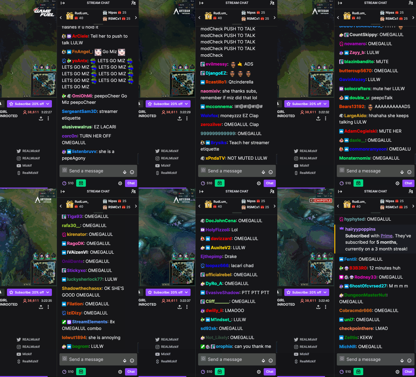
Chats in popular live streams tend to move rapidly with increasing viewers participating in the discussion, which leads to the chat overloading with different messages. This behavior denies the opportunity for viewers to have a meaningful conversation with the streamer. As a result, chat participants disengage from the streaming service.
My contribution
Survey creation and interview preparation
Interview participants on their Twitch experiences
Analysis of data collected using affinity diagraming
Low and high fidelity prototypes in Figma
Conduct usability testing sessions
What did I learn?
I learned the significance of having a rationale for selecting research methods at each specific stage in the design process. By understanding the purpose and objectives of each stage, I realized the importance of aligning research methods to gather relevant data and make informed decisions.
Here's a brief summary that takes only one minute to read
Phase 1: Research
We began the project with surveys and interviews to understand how people are currently using Twitch and the chat functionality.
Survey distribution
Goal
Understand Twitch users' goals and pain points while reading the chat and recruit participants for interviews.
Method
We developed a 15 question survey using Qualtrics XM and distributed it on Discord servers, Reddit and Facebook pages.
Data analysis
We received 49 responses within a week of distribution. Out of the 49 respondents, 47 identified as Twitch users, we only counted their responses for the rest of our analysis.
Findings
More than 50% of respondents selected that the chat was what they use the most.
Participants stated that the chat goes too fast and they are not able to read anything.
More than half of the respondents identified as Twitch viewers.
Semi-structured interviews
To gain deeper insights into users' reading challenges while engaging with Twitch chat, we conducted interviews with five individuals who have experienced difficulties in this regard.
We took the insights from the interviews and created an insightful affinity diagram in Miro. Taking a collaborative approach, each team member individually explored the diagram, extracting valuable insights. Our team then reconvened to engage in a discussion, uncovering further implications and potential solutions.

We identified the following themes from our user interviews:

Phase 2: Design implications
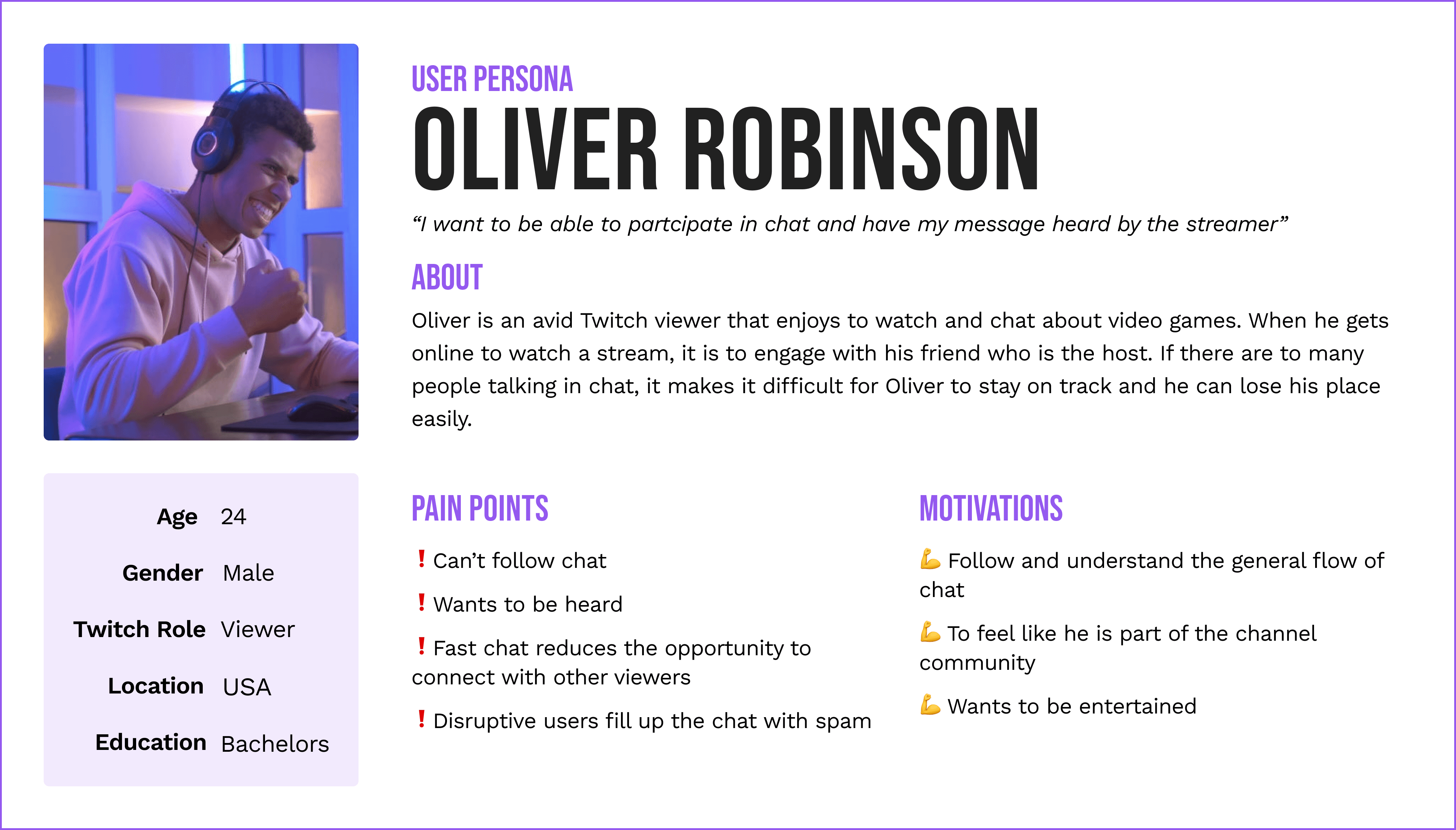
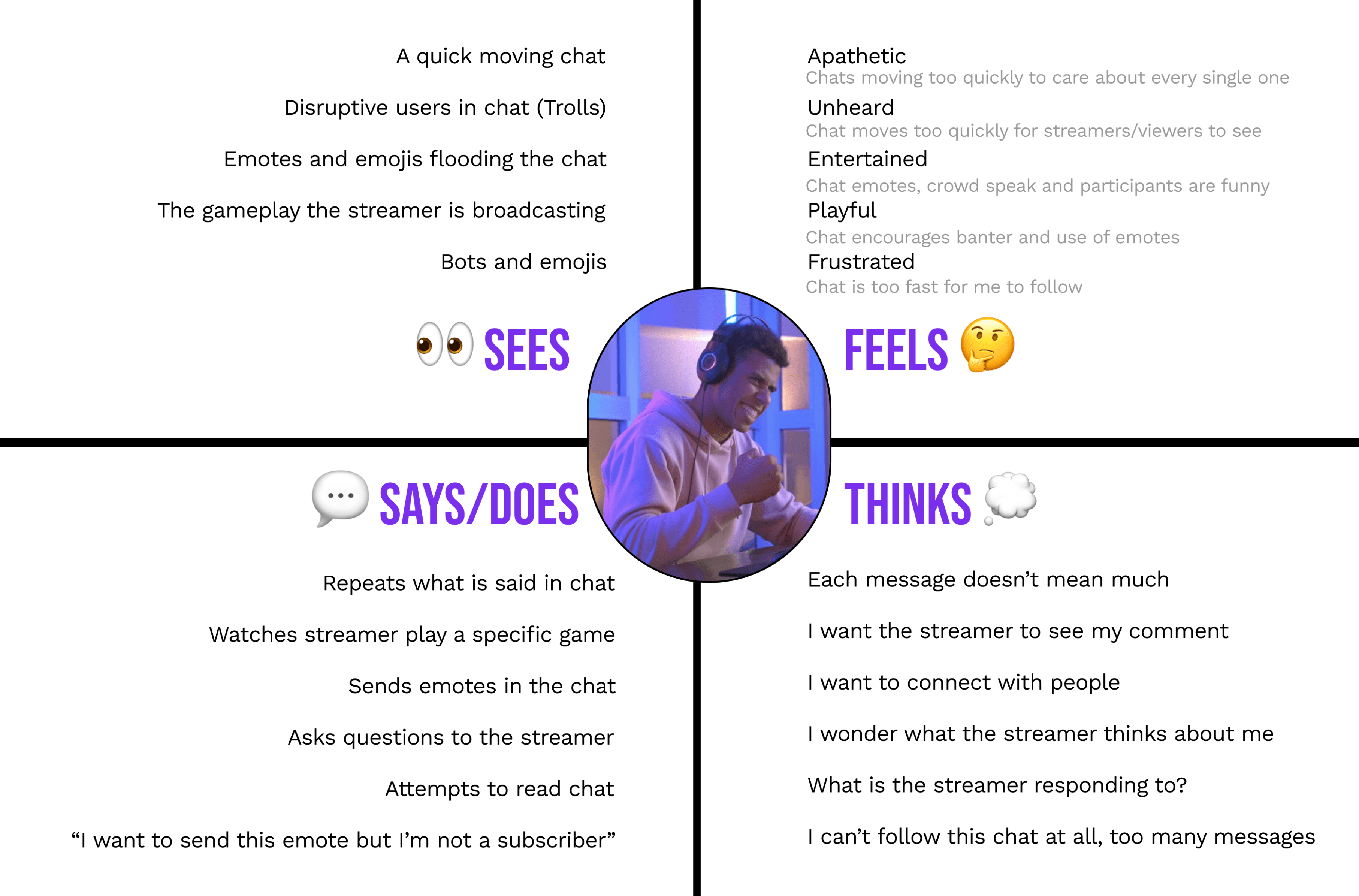
Based on our research findings and insights from Phase 1, we developed the design implications for our future prototype including our user persona and empathy map.
Phase 3: Design artifacts
Building upon the research findings and valuable insights obtained during Phase 1 and 2, we crafted a range of design artifacts to fuel the development of our future prototype.
Feature 1: Chat Settings Redesign
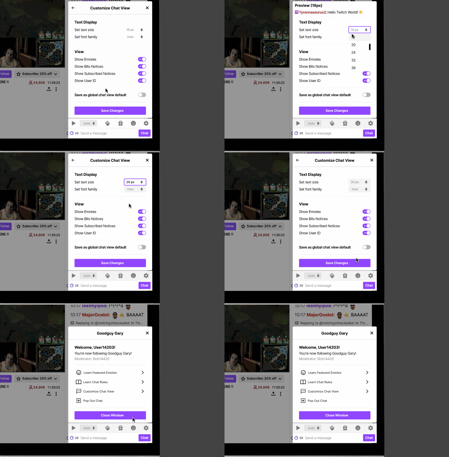
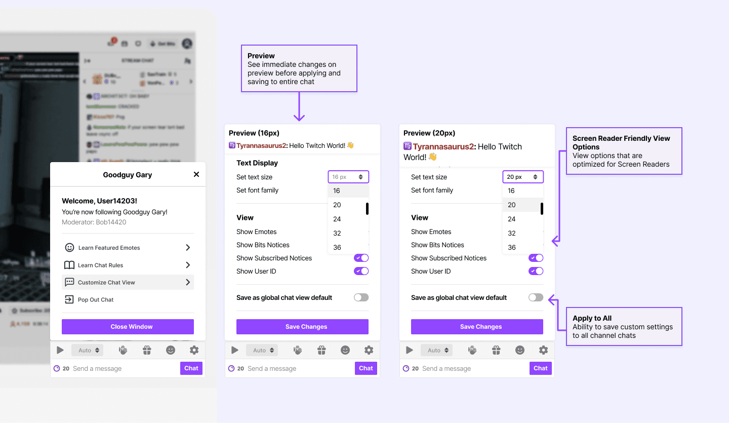
Our initial research showed that users were unaware of the existing customization capabilities that Twitch provided for the chat view. The font customization feature is currently hidden in the chat feature of Twitch, and we restructured the UI so that the chat setting is at the primary level.
Additionally, having a clear chat setting provides a centralized place where users can easily discover other chat functionalities. To increase legibility, we also included the ability to change font style, to better accommodate readers who may have a harder time reading certain fonts.
Feature 2: Chat Playback Speed
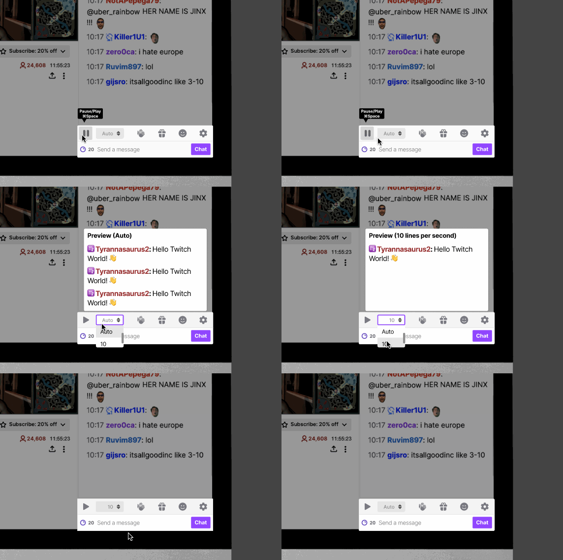
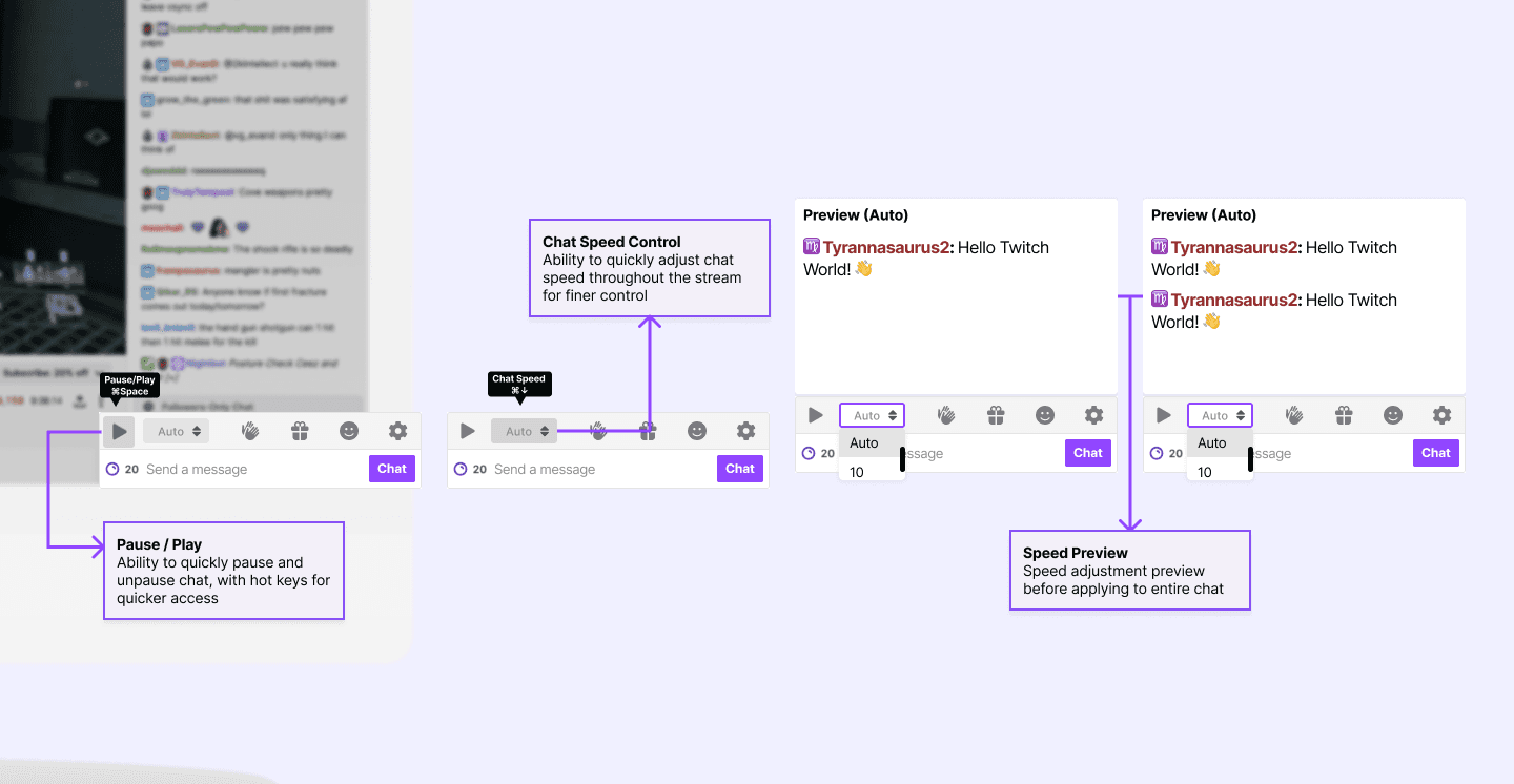
Our research revealed varying user experiences in keeping up with Twitch chat feeds, depending on the channels they followed. Channels with fewer viewers and participants offered easier readability, while channels with a large viewership posed challenges. To address this, we introduced a speed customization feature within each channel's chat, empowering users to personalize speed settings for individual channels.
During usability testing, we observed that some users encountered difficulties navigating directly to the chat playback speed option. As a solution, we relocated it to the main chat settings page for enhanced accessibility. By incorporating this option into the primary chat settings screen, our goal is to streamline the process and help users save time while adjusting the chat playback speed.
Feature 3: Highlights to understand what the general chat is saying
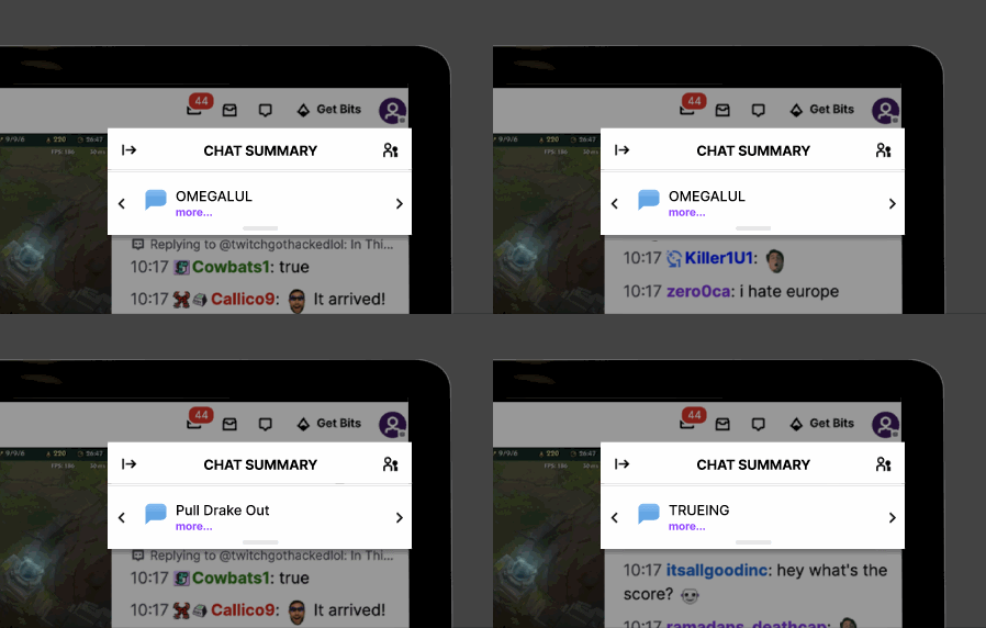
To meet users' need for a quick grasp of chat content, we introduced CrowdSpeak AI to Twitch. This feature summarizes user discussions into concise blurbs visible to all viewers, ensuring rapid comprehension. For instance, if multiple users discuss strategies for defeating a particular Minecraft mob in rapid succession, the AI-powered chat highlighting function summarizes the conversation in a brief line of text, facilitating quick comprehension.
Expanding the "Chat Summary" reveals a list of messages that contributed to the AI-generated summary, arranged based on their chronological occurrence in the chat. In future iterations, we envision incorporating a search bar functionality, empowering users to search for specific keywords mentioned in the chat.
Phase 4: Design evaluation
After creating design artifacts it was time to test! We made sure to uncover usability issues with expert evaluations and usability tests.
Expert evaluations
Goal
Uncover the common usability issues that experts can quickly identify following the heuristic principles.
Method
Three experts evaluated our prototype according to Nielsen Norman’s 10 Heuristics. We asked them to think aloud when navigating the prototype.
Findings
The three experts agreed that there were cosmetic issues with our prototype but should be given less priority.
Experts suggested that giving the users to ability to preview the setting could improve our visibility of system status.

Usability testing
Goal
To test whether we were creating a user interface that is simple, intuitive, and easy to understand for our target user group as well as meeting their needs.
Method
Our usability testing involved task-based assessments with embedded interviews. Participants were then asked to complete a System Usability Scale (SUS) survey to gauge their overall experience.
Analysis
Analyzed the SUS scores of each participant following the SUS guidelines
Organized the notes from our usability study to Google Sheets, and then we transferred to a Miro Board.
Divided the notes by each task, and we collectively worked to find common themes that participants brought up during the session.
Findings
The average score from all participants was 71 which is close to the average for a system that is likely to be recommended to use by others according to the SUS guidelines.
We found a common issue that participants had with the information architecture of our design.
Recommendations
After conducting usability sessions and expert evaluations, we were able to draw significant conclusions about how the design of our prototype should change going into further iterations.
We identified three key issues that our design would need to address. We received great information that allowed us to look at our prototype differently.
Project takeaways
Making an impact
Through innovation and determination, we were able to create design artifacts that would help people of all reading levels to enjoy the content.
Improving UX research skills
This project, with its research focus, enabled me to enhance my abilities in conducting interviews and developing surveys.
Made by Max with Figma and Framer